.png)
Creative X

CREATED BY
18:10
6 Impressive Editor X Websites | But Do They Pass the Mobile Test?
6 Impressive Editor X Websites | But Do They Pass the Mobile Test?
Hey there, fellow web design enthusiasts! Welcome to another inspiring blog post brought to you by livelearning.editorx.io, your trusted resource for mentoring on how to build and grow your design businesses and furthering your career.
Today, I'm excited to bring you a list of 6 phenomenal websites built with no-code in Editor X. These sites not only look fantastic, but they're also designed to work flawlessly on mobile devices—of course, that's what we're here to find out! So, buckle up and let's dive right into these gorgeous designs to see if they pass the responsive test!
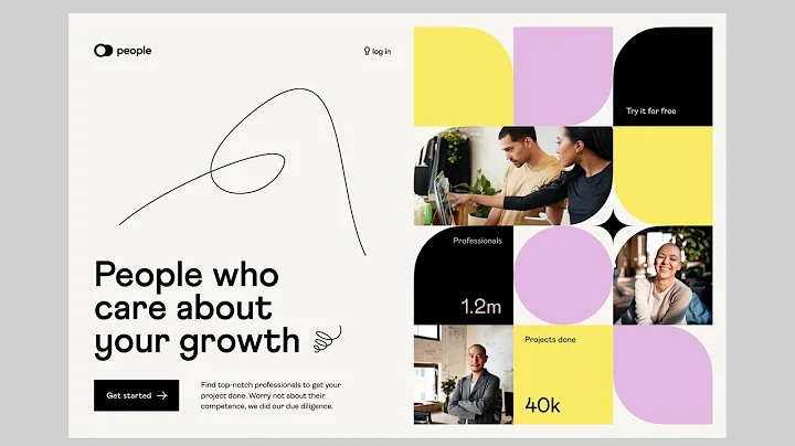
1. Melitas Ventures by Some Creative
Website: Melitas Ventures
Melitas Ventures is a venture capital fund based in New York that invests primarily in food and beverage companies. Their web design, created by Some Creative, has a clean, modern appeal with a focus on compelling visuals.
Upon landing on the homepage, you're immediately greeted with a stunning full-width hero section that cycles through different images of their portfolio companies. The site goes against the grain and includes a hamburger icon for the main navigation, even on large desktop screens.
While scrolling down, you notice some neat effects and transitions, such as the sticky portfolio section showcasing the companies they've invested in. The site also features an interactive "Meet the Team" section with hover animations for each team member.
Despite the captivating imagery and effects, there's some room for improvement when it comes to typography. The main body text on this site is quite small and runs long line lengths, both of which may raise some concerns regarding readability.
2. Pure Japan | Experiences by Teleblanco Agency
Website: Pure Japan | Experiences
Next up is Pure Japan | Experiences, a website designed by Teleblanco Agency, which offers guided tours in Japan. This site effectively utilizes whitespace and breathtaking images to create an immersive virtual journey through Japan.
On the homepage, you're instantly captivated by a beautiful full-screen video showcasing various aspects of Japanese culture. As you scroll down, you discover more information about their tours and some amazing testimonials from satisfied clients.
However, when viewed on a smartphone, the text in some sections can become quite small, making it hard to read. Nevertheless, the overall design remains highly responsive and most components scale properly across various devices.
3. Cyberdots
Website: Cyberdots
Cyberdots, created by the Cyberdots Design Studio, is an elegant and minimalist web design studio website. The site features a beautiful, clean interface, complemented by smooth animations and transitions as you navigate through different pages.
At the top of the homepage, there's a bold and succinct mission statement, followed by an overview of services and featured projects. Each project has a dedicated page showcasing the final product, design process, and project outcome.
Cyberdots' site does a fantastic job maintaining its responsiveness when viewed on a mobile device. The site smoothly adapts to fit smaller screens without compromising its clean and minimalist design.
4. Pin & Tucker
Website: Pin & Tucker
Pin & Tucker, designed by the Pin & Tucker team, is a social shopping app that connects users who love fashion. The website features vibrant colors and playful animations that create a fun and dynamic user experience.
The homepage is straightforward, focusing on a clear call-to-action that prompts users to download their app. As you scroll down, you'll discover more about the app features and some screen images that illustrate how it works.
Although the mobile presentation of this site is mostly on point, there's room for improvement, especially when it comes to scaling down the text for enhanced readability on smaller devices.
5. KARALI
Website: KARALI
KARALI is a children's clothing brand with a fresh and playful web design, created by Anatz. The site features a delightful color scheme, adorable illustrations, and animation effects that give it a unique and engaging personality.
As soon as you enter the homepage, you're met with an animated hero section displaying a collage of images featuring their adorable products. The site also displays some featured products, making it easy for users to browse and shop.
When it comes to mobile responsiveness, KARALI's website performs incredibly well. The site elements effortlessly adapt to smaller screens while retaining its playful and vibrant design.
6. Rootastes
Website: Rootastes
Our final website, Rootastes, created by Jasmin Design Studio, offers a visually stunning and mouth-watering culinary experience. Rootastes is a meal delivery service that focuses on excelling in taste and providing a healthy, well-balanced experience.
The homepage is packed with tempting food images, accompanied by colorful and bold typography that complements their dynamic design. As you scroll through the site, you'll encounter more details about the meals they offer and the story behind their brand.
Despite the multifaceted design elements, Rootastes' website does an exceptional job maintaining its responsiveness on mobile devices, ensuring that both desktop and mobile users have an excellent browsing experience.
Wrapping Up
There you have it—a list of 6 gorgeous Editor X websites and a little test run on their mobile responsiveness. Overall, these sites offer captivating designs that mostly perform quite well on various devices. Of course, there's always some room for improvement when it comes to typography, spacing, and scaling elements, but that's simply part of the web design journey!
If today's post inspired you, why not join the next Monthly NoCode Design Challenge W/ Prizes and showcase your creativity? Remember, our livelearning.editorx.io community is here to help you build your design business and further your career with invaluable resources and mentorship. So don't wait—get started today! Happy designing!


Join over 5,000+ people learning, helping each other to scale their freelance/design business, taking no-code challenges, collaborating, talking about their projects, and more!
Join Designers & Creatives From All Over The World!
Supported by our partners and affiliates

More Like This #Tag
Brad Hussey | Freelancing As A Web Designer & Creating Online Courses That Sell (Passive Income)
Editor X TV | With Brandon Groce
1:12:35


Intro To Editor X Masterclass | Build A Free Website Tutorial For Beginners #001
Editor X TV | With Brandon Groce
1:24:11